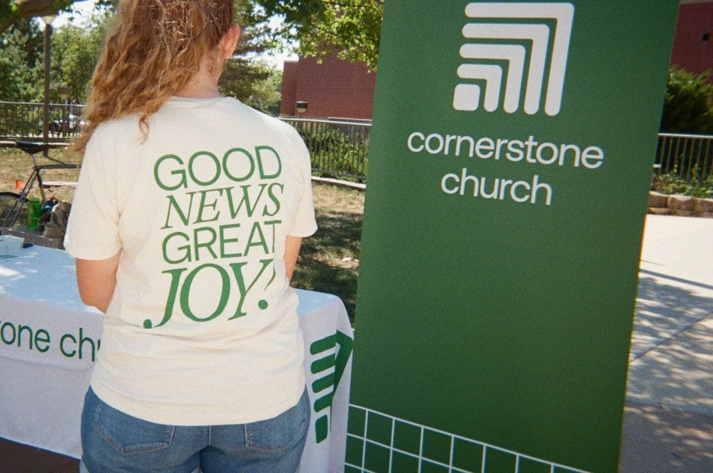
Cornerstone Church
Cornerstone Church needed a brand refresh that honored its history while giving the team a modern, flexible system they could actually use every week.
The Challenge
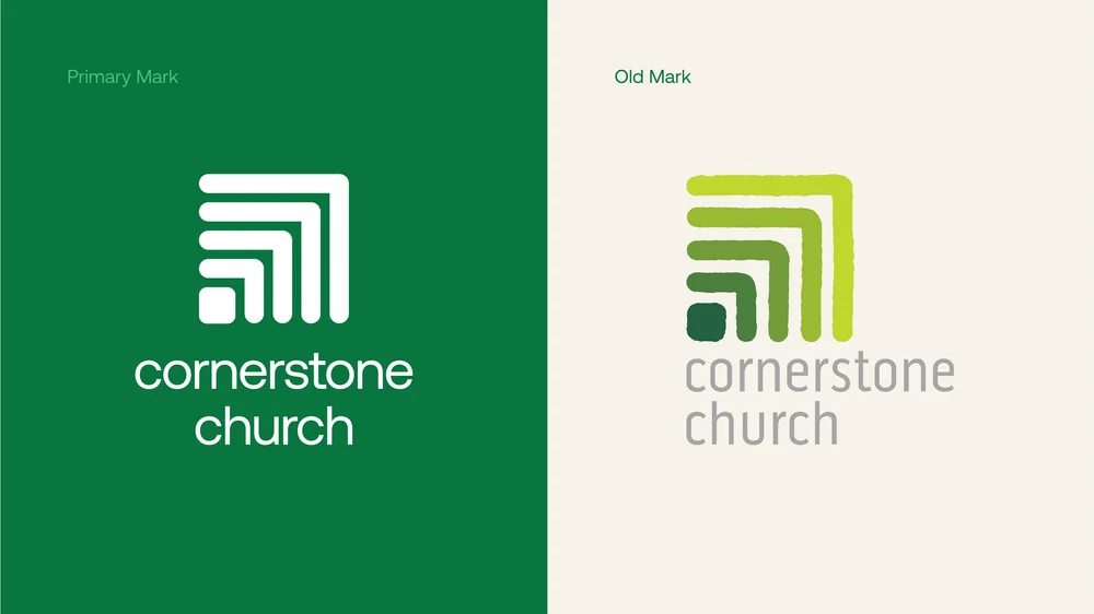
The existing mark had equity with the congregation but was aging visually and hard to reproduce across print, screens, and merch. The refresh had to feel like an evolution, not a replacement.
The Approach
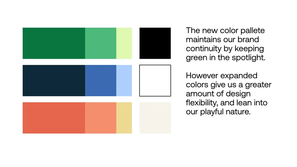
I kept green in the spotlight to maintain brand continuity, then expanded the palette to give the team more design flexibility and a more playful range. The new mark simplifies the original into a cleaner geometric form that holds up at any size.
The Outcome
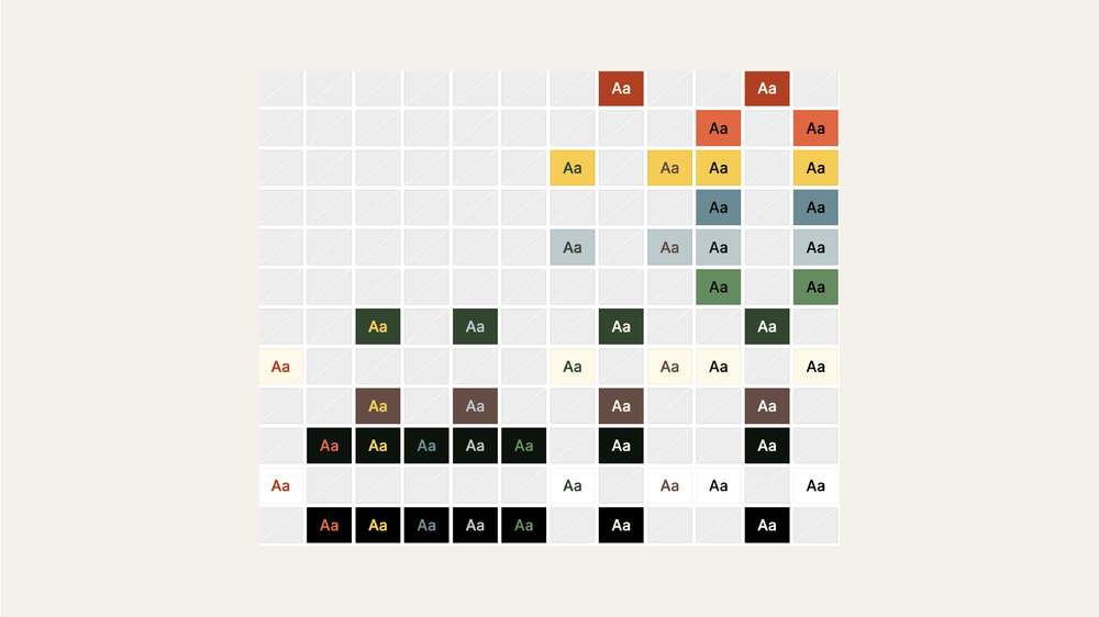
A complete identity system with logo variations, color guidance, and slide templates the church staff uses across sermon series, social media, and print without needing a designer in the room.